

Yield curves, flattening, inverted, recessions, 2-10 spread, risk premia: these all might sound like answers to a Family Feud category if Steve Harvey said to name something that is confusing investors today. We mentioned at the end of 2017 that these words would be thrown into your airwaves on an unsolicited basis. A lot of the conversation up until this point has been noise. But there is some fundamental merit to the conversation. Cue up the Kenny Loggings, we’re about to drown the excess out for you.
WHAT A YIELD CURVE MEASURES
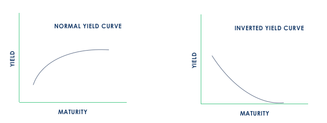
A little background before we skip ahead to the board’s top answers. The yield curve is typically an upward sloping measure of the reward investors require for taking on additional duration with certain fixed income securities. If an economy is in a stage of sustainable growth that is expected to continue, investors will be less inclined to hold risk-free assets, leaving the yields higher for longer dated bonds. If those growth prospects seem to be deteriorating, investors may scramble to less risky assets, bidding up the price of these bonds driving yields lower. Check out our original Picassos below for an illustration.
The yield curve and the spread along it is just one metric that can be used when assessing the investment environment. We’ve mentioned this before, but it’s clearly important to put these “indicators” into some form of context and not assume they’re the equivalent of investment traffic lights. But we digress. Let’s talk spreads for a minute.
SPREADS
The reference to the spread of the yield curve is something that has been widely discussed this year. We’d consider this material for the 200-level course on yield curves. The most commonly referenced spread is that of the yield between 2-and 10-year U.S. government debt. What we’re dissecting here is the premium investors are requiring for taking on longer-dated debt relative to the debt they’d be taking on for shorter-dated maturities. As the yield curve moves from its normal upward sloping profile to the dreaded inverted slope, these spreads must naturally tighten. As we pointed out, these yields will move in accordance with growth expectations. If growth expectations are dwindling, investors tend to flock in droves toward risk-off (or in this case, risk-free) assets for protection. This is what would drive the yield on the longer end of the curve lower, in essence tightening the spread.
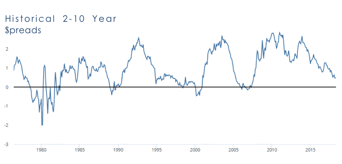
Why do people care about a flattening curve? Well they tend to jump ahead to what follows it, an inverted one. Below is the historical 2-10 year spread of U.S. government debt. The shaded areas reflect economic recessions. The one consistent characteristic here? No recession has occurred without an inverted yield curve preceding it.
Investors are quick to think that the flattening of the curve is an overnight development and that recessions are right around the corner. Being the flawed humans we are, naturally we’d expect certain asset classes that perform favorably during times of economic expansion would suffer during this process. Take a look below; we hope we can kill two birds with one stone. These are the total returns of the listed indices in conjunction with the tightening spreads illustrated above1.
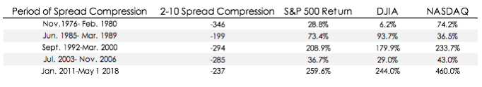
There isn’t one curve tightening scenario (peak to trough) where U.S. equities, (as measured by S&P, DJIA and NASDAQ) didn’t finish positive. Only once did one of the indices above not provide a double-digit return, the Dow from November 1976- February 1980. Now, that’s not to say there wasn’t some turbulence along the way. Each of these very long time periods saw their fair share of price corrections. That’s normal and should be expected. From June of 1985 through March of 1989, the 2-10 spread tightened 199 basis points. The smallest compression of any scenario. The Dow finished this period up 94%, and yes that included the Flash Crash of 1987 where it erased 22.61% in one day2. Equities can and have performed well in these periods. In just about each of these periods, these indices provided above normal annualized returns. There’s no rule, written or unwritten, that says they can’t do this in the future either.
LAG
What about the recession indicator? The inverted yield curve is batting 1.00 dating back to the 70’s when it comes to foreshadowing a recession. But it doesn’t happen overnight, and the curve doesn’t go from 0-100 (or in this case 100-0) real quick. On average the peak to trough process has taken 1,651 calendar days to happen. The current process? At the start of May, we were on day 2,678. Above trend, but still shy of the 1992-2000 measure of 2,769. During that time, spreads remained below 69 basis points from December of ’94- January of ’993. These things take a while and are unpredictable.
Take a closer look at the chart above and you can see the lag between the recession kicking off and the inversion taking place as well. That’s because these relationships aren’t magical indicators that have some light switch type of power over markets or economies. There are real, slow moving, fundamental characteristics at play that are being measured with these pictures. Actual economic stress needs to make its way through the system, initially weighing on profit margins and corporate bottom lines.
WHAT GETS US THERE?
Good question. We don’t have the answer, quite frankly nobody does. One variable we think can be counted on, as it has been time and time again, is time. Economic expansions die out, and ultimately that’s what’s being measured here. Another variable at play today is a Federal Reserve who’s hiking interest rates as we speak. If we’re in the 107th month of the current economic expansion and dealing with a central bank who is raising rates, that will help the Kenny Loggins music get a bit louder. But with a low interest rate target and tepid growth throughout the recovery, we don’t exactly see the Fed’s current schedule as a threat for a hard landing for the economy. Over time, credit conditions will tighten due to the rising rates, ultimately bringing the recovery to an end. That’s a peaceful way we can become inverted; nobody said it had to be tragic.
SOURCE: This presentation is solely for informational purposes and should not be taken as investment advice. For further information, please contact one of our investment adviser representatives. Yield Curve Charts are for illustration purposes only. Chart provided by Federal Reserve Bank of St. Louis. Data in table provided by Bloomberg. 1 Bloomberg. 2 Federal Reserve Bank of St. Louis.
LEGAL STUFF
THIS PRESENTATION (THE “PRESENTATION”) HAS BEEN PREPARED SOLELY FOR INFORMATION PURPOSES AND IS NOT INTENDED TO BE AN OFFER OR SOLICITATION AND IS BEING FURNISHED SOLELY FOR USE BY PROSPECTIVE CLIENTS IN CONSIDERING GFG CAPITAL, LLC (“GFG CAPITAL” OR THE “COMPANY”) AS THEIR INVESTMENT ADVISOR. THE OPINIONS CONTAINED HERIN ARE NOT RECOMMENDATIONS.
THE INFORMATION CONTAINED HEREIN HAS BEEN PREPARED TO ASSIST INTERESTED PARTIES IN MAKING THEIR OWN EVALUATION OF GFG CAPITAL AND DOES NOT PURPORT TO CONTAIN ALL OF THE INFORMATION THAT A PROSPECTIVE CLIENT MAY DESIRE. IN ALL CASES, INTERESTED PARTIES SHOULD CONDUCT THEIR OWN INVESTIGATION AND ANALYSIS OF GFG CAPITAL AND THE DATA SET FORTH IN THIS PRESENTATION. FOR A FULL DESCRIPTION OF GFG CAPITAL’S ADVISORY SERVICES AND FEES, PLEASE REFER TO OUR FORM ADV PART 2 DISCLOSURE BROCHURE AVAILABLE BY REQUEST OR AT THE FOLLOWING WEBSITE: HTTP://WWW.ADVISERINFO.SEC.GOV/.
ALL COMMUNICATIONS, INQUIRIES AND REQUESTS FOR INFORMATION RELATING TO THIS PRESENTATION SHOULD BE ADDRESSED TO GFG CAPITAL AT 305-810-6500.