

Dry powder. Liquidity. Scratch. Paper. It seems that investors and those responsible for the building and management of portfolios have no shortage of nicknames for their cash position. Even outside the investment industry, cash has maintained a prominent role in our society. Today, it’s still the main source of transaction execution, ahead of debit and credit cards1. Cash is king. Until it’s not. This affinity for the greenback (our only one, we promise) has created this sense of security for investors and consumers alike. But there’s one term for cash that investors need to be aware of when speaking about their portfolio: drag. Before investors decide to build their mountain of powder they should ask one thing: “What happens when cash ruins everything around me?”
“I JUST WENT TO CASH”
It’s a phrase that investors are quick to tell you when the discussion of markets arise in almost every social setting. It’s almost garnered more appeal than discussing individual stocks in investors’ portfolios. This idea of being able to call a market top and take your ball and go home until the storm passes makes some heroic assumptions about human psychology. But we’ll get to that.
Over the past nine years since the financial crisis, it seems like this paranoia has been on a steady simmer in the back of market participants’ minds. This can be observed, in our view, by the slowly increasing levels of the SKEW index since the beginning of the recovery in the spring of 2009. We’ve discussed the SKEW index in the past, but as a refresher: it’s the cousin to the widely discussed VIX index. The SKEW index is a measure of market sentiment for “tail risk” events happening in the market, effectively pushing the returns of the S&P 500 further out into the distribution of potential returns. As this index climbs, we view this as a proxy for uncertainty and queasiness of investors climbing. This index is priced similarly to the VIX index, by measuring the price of the long-dated out-of-the-money put options. If someone were to be purchasing these options, they’d be granting themselves the right to sell exposures of the S&P at a lower price in the future. Thus, allowing them to profit from a market downturn.
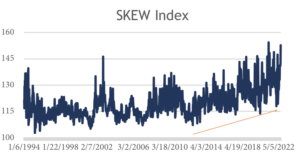 Take a look at the graph to the right. Since the beginning of the rally in U.S. equities in 2009, there’s another interesting positive-sloping trend that can be observed in the SKEW index2. Coming out of the worst financial crisis since the Great Depression, investors have not only been skeptical of the economy’s recovery but the market’s recovery too. Look at that chart.
The level of the SKEW index has steadily climbed higher since 2009 in the same fashion the S&P 500 has. We’ve been registering higher readings (higher levels of concern) in the index since the Dot Com Bubble and the Great Financial Crisis, and we’re in the midst of the longest economic expansion since World War Two. Really?
NO SHORTAGE OF EXCUSES
Usually after someone has just informed their comrade they’ve moved to cash, the immediate follow up is “This market is making me uncomfortable.” To that, we’d say Rob Arnott of Research Affiliates said it best when he proclaimed, “What is comfortable is rarely profitable.” 3 But what is almost always cited is “We’ve gone up for too long” or “Valuations are too high.” To that, we think there’s a bit more material answer than can be provided.
First, let’s take a look at what happens to one’s return when we start to leave the market, as opposed to remain invested. If equities are behaving a bit too much like equities for your taste, you might find yourself thinking you could leave the market and come back when conditions suit you better. The problem is, the market doesn’t stop when you leave.
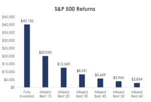 To the right we highlight the performance of the S&P 500 from 1998 through 2017. When backing out the 10 best single-day performances of the index, the return on an investment gets slashed by 50%4. This trend continues as you back out the next 10 best days and repeat the process.
Sure, someone who’s concerned with the market’s current standing might respond with “Well how am I supposed to know when the single best days are?” Which is kind of our point. In that time period outlined, six of the 10 best single days occurred within two weeks of the 10 worst days5. This left you an exceptionally tight window to leave the market and make the decision that now is the right time to get back in. So, let’s just make sure we’re on the same page: an investor is supposed to self-aware enough to decide in real time that this is the top of the market, I’ve left my comfort zone and need to move to cash and wait this out. Then I’ll return to the market at the exact bottom of the price where said decline ends? Got it.
This last part is perhaps the most overlooked aspect of this entire approach. If an investor were so uncomfortable when the market was giving the appearance of only going up, why would they think they’ll be in their wheelhouse of emotions when the market is seemingly going down with no end in sight?
DRAWDOWNS ARE PART OF THE PROCESS
One way we think investors might be able to better defend themselves, if not psychologically more than anything else, is to be fully aware of what they’re getting themselves and their portfolio into. If you’ve just implemented an investment plan that involves a considerable amount of equity exposure, be prepared for equity behavior. While 2017 will long be a topic of study for years to come, we’ll broaden our historical period of reference just a bit. Since the S&P 500’s rally began in 2009, the U.S. equity market has been a steam engine. But that crescendo higher hasn’t been totally uninterrupted. Here’s a list of pullbacks of at least five percent in the S&P 500 since the bottom in early 2009 6.
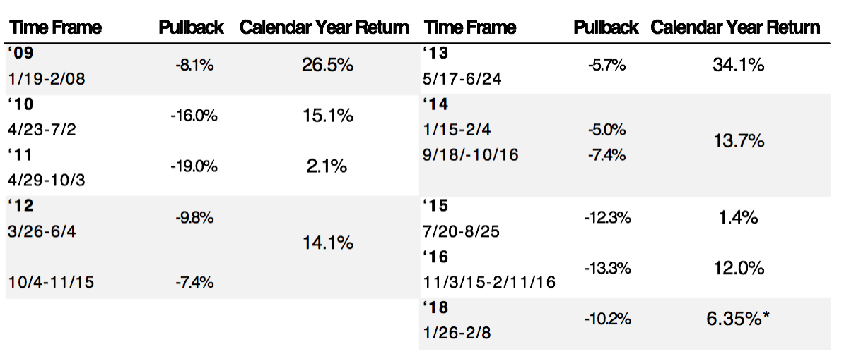
Since 2009, the S&P 500 has experienced a pullback in price of at least five percent (on a closing basis) 1.2 times per year. Dating back to 1945, the S&P 500 has seen a price decline of at least five percent 115 different times. That’s roughly 1.6x a year 7. So, while the last 10 years has been slightly quieter, we’re comfortable calling this normal behavior. What we think is important to draw your attention to as an investor, novice or veteran, is the fact in the 10-year period above, the S&P 500 hasn’t seen a calendar year of negative total return. Not shown in that table is 2017 and its 21% total return.
Now marry this reality with perception of unease as indicated by the SKEW index in the same period. Investors could have, did and continue to come up with endless reasons as to why “this is the top.”
For those investors that acted on this fear and did in fact move to cash, they have introduced an unforced error to their investment process. And any casual tennis fan could tell you the player with the greatest amount of unforced errors tends to fail to dig themselves out of the hole they’ve dug for themselves. A greater risk than price volatility could ever pose to your portfolio in our eyes.
VALUATIONS
We’re not saying concern should never enter the mind of an investor. But we believe these concerns should be met with curiosity and evidence instead of panic. Maybe that’s a tell on where we stand on the fight or flight spectrum. The most commonly cited reason we’ve heard from investors for their periodical concerns is valuations. And valuations most certainly play a role in an investment’s expected return. But valuations in and of themselves are not exactly a signal of catastrophe ahead. Take a look below. We’ve compiled the forward 12, 24, 36 and 60-month total returns for the S&P 500 over the last 35 years when the index was priced at different forward P/E valuations 8. A general rule of thumb is an asset priced at higher valuations carry lower expected returns. Think of it as a higher hurdle for your investment to clear before you turn a profit. What this data shows us is that concept plays out pretty close to expectation in reality.
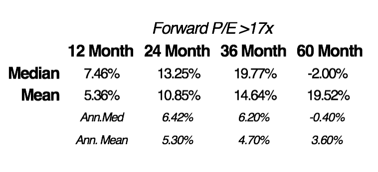
Over each of the time horizons outlined above, the greater the forward valuation, the lower the return began to trend as time went on. That green shaded area represents where the S&P 500 is valued today (~17x forward earnings). As you can see, today’s price tag on the S&P isn’t particularly cheap but is far from excessive relative to the last 35 years.
In this analysis period, here’s a look at what the market did moving forward when the forward P/E was greater than 17x 9.
So, just as we think knowing what an investor is getting themselves into is in their best interest, also being aware of what expectations could be moving forward is as well. If an investor were armed with this information before they hit sell on their equity exposures, there’s the chance (a good one) that they could have rationalized with themselves with remaining invested. In fact, during the rally of the S&P 500 since 2009, the average forward P/E ratio has been 17.4x. Placing today’s market price tag smack dab in line with the average over the last nine years. Yet, there’s been constant concern from investors and pundits alike, leading many to sacrifice the chance at returns they may never see again.
RISK
As you might be able to gather, risk, to us, is not just the fluctuation of price or valuation of an asset. To us, real risk is allowing for emotions to overpower research and evidence within the investment process. Which seems like the bigger risk to your portfolio? That chart above where, historically, equities brought in slightly lower than historical average returns, but still positive? Or exiting the market due to emotion and taking the chance of leaving too early and getting back in too late? Playing double-dutch with your portfolio is a lot like trying to play double-dutch in real life. Expectations tend to be far from reality.
SOURCE: This presentation is solely for informational purposes and should not be taken as investment advice. For further information, please contact one of our investment adviser representatives. 1 Economist. 1 Federal Reserve Bank of San Francisco. 2 Data provided by Bloomberg, chart created by GFG Capital. 3 Robert Arnott. 4 Data and graph provided by J.P. Morgan. 5 J.P. Morgan. 6 Data provided by Bloomberg. 7 Data provided by Bloomberg. 8 Data provided by Bloomberg, charts made by GFG Capital. 9 Data provided by Bloomberg, table created by GFG Capital.
LEGAL STUFF
THIS PRESENTATION (THE “PRESENTATION”) HAS BEEN PREPARED SOLELY FOR INFORMATION PURPOSES AND IS NOT INTENDED TO BE AN OFFER OR SOLICITATION AND IS BEING FURNISHED SOLELY FOR USE BY PROSPECTIVE CLIENTS IN CONSIDERING GFG CAPITAL, LLC (“GFG CAPITAL” OR THE “COMPANY”) AS THEIR INVESTMENT ADVISOR. THE OPINIONS CONTAINED HERIN ARE NOT RECOMMENDATIONS.
MENTION OF SPECIFIC ETFS, MUTUAL FUNDS OR SINGLE SECURITIES IS FOR INFORMATIONAL PURPOSES ONLY AND NOT A RECOMMENDATION TO BUY THAT SECURITY. GFG CAPITAL MAY OR MAY NOT CARRY EXPOSURE TO SECURITIES MENTIONED AT A GIVEN TIME.
THE INFORMATION CONTAINED HEREIN HAS BEEN PREPARED TO ASSIST INTERESTED PARTIES IN MAKING THEIR OWN EVALUATION OF GFG CAPITAL AND DOES NOT PURPORT TO CONTAIN ALL OF THE INFORMATION THAT A PROSPECTIVE CLIENT MAY DESIRE. IN ALL CASES, INTERESTED PARTIES SHOULD CONDUCT THEIR OWN INVESTIGATION AND ANALYSIS OF GFG CAPITAL AND THE DATA SET FORTH IN THIS PRESENTATION. FOR A FULL DESCRIPTION OF GFG CAPITAL’S ADVISORY SERVICES AND FEES, PLEASE REFER TO OUR FORM ADV PART 2 DISCLOSURE BROCHURE AVAILABLE BY REQUEST OR AT THE FOLLOWING WEBSITE: HTTP://WWW.ADVISERINFO.SEC.GOV/.
ALL COMMUNICATIONS, INQUIRIES AND REQUESTS FOR INFORMATION RELATING TO THIS PRESENTATION SHOULD BE ADDRESSED TO GFG CAPITAL AT 305-810-6500.