


The first 273 days of the year are in the books and assuming your focus is on the United States equity market, it’s been quite an impressive year. The third quarter wrapped up and it marked the strongest third quarter on record since 2013 for the S&P 500. The seasonally weak September even proved to be resilient, as the month ended with a positive return for the S&P 500 in the final trading days of the period. In the three months ending September 28 alone, the S&P 500 climbed 7%, bringing the total return for the U.S. index north of 10.5% YTD. Sounds great, right? Shift your sites from those 505 U.S. companies and you might think the borders of the United States marked the edge of the Twilight Zone. As far as the eye can see, and beyond Christopher Columbus’ (alleged) journey, lies a sea of red. Emerging market equity and debt, foreign developed equity and debt, the U.S. aggregate bond market…all negative total returns year to date through the third quarter. This has left many investors advocating for the U.S. equity market as the only market worth participating in, and some scratching their heads. The start of the fourth quarter seems to have provided an answer to the latter, and perhaps generated concern for both points of view. In the first few sessions of the final quarter of the year, the S&P 500 has played catch up, shaving 5% off its return for the year1. Volatility seems to have come back from summer vacation.
Recent Market Drivers
Why Bond Yields Matter
We’ve been talking about bond yields rising for awhile. Just about every month for the last two years if you’ve been following along at home. So forgive us for asking you to not write us off as just another pundit using hindsight to reach for an annecdote. But we disagree with anybody telling you that bond yields rising is why equities have sold off considerably at the start of the fourth quarter. That’s not the point that anybody should be trying to make. Rising hurdles for equity risk premium is a real thing. We think there are a few points worth being aware of though.
For starters, the U.S. 10-Year yield just rose by 3% in the third quarter bringing the interest rate investors are demanding from the U.S. Government on their loan to 3.05% on a 10 year loan. We haven’t demanded such a return from the worlds largest economy since 20112. Rising bond yields in the most recent quarter, coupled with the seasonally weakest month for equities, sounds like the perfect scape goat for equities to decline, right? Nope. Stocks were positive in the quarter and the month.
What about the year? Stocks finished the first 9 months higher by 10.5%, the U.S. 10 Year yield rose by 27% in the same period. Next.
When bond yields seemingly bottomed in the summer of 2016 at 1.37%, it was the start of the current acceleration in yields. Through the third quarter bond yields had risen 122% from that point. Surely stocks have struggled since, right? The S&P 500 returned 38.7%3. This is getting awkward.
So, clearly, we don’t necessariy believe the narrative thrown out there that rising bond yields are bad for stocks. In fact, intuitively speaking, rising yields means falling prices. Which means rising stocks, while bonds fall. This seems to fit the conventional wisdom of negative correlation. Now, we know correlations are a fickle thing and seem to have a mind of their own. So here’s a look at some more historical scenarios4:
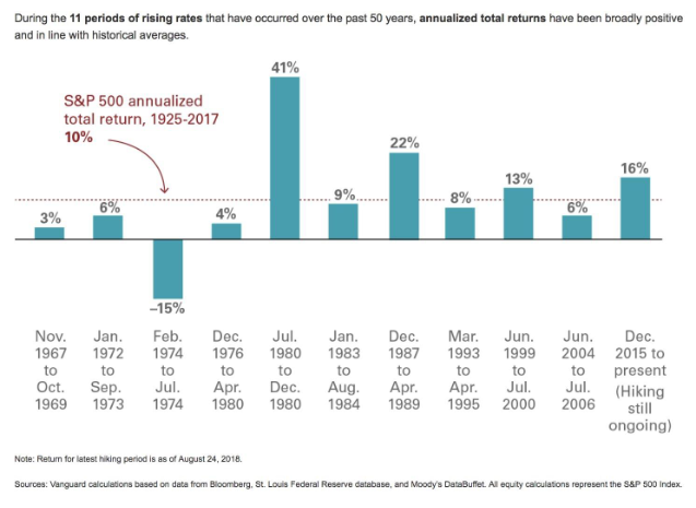
If rising yields don’t seem to directly correlate to weaker equities, then why are we being asked to believe this? No clue.
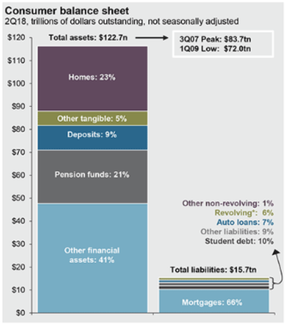 Here’s why it is important to pay attention to bond yields. We promise it’s not all that bad. First, let’s take a look at you, the consumer, for a minute. Here’s the balance sheet for the U.S. consumer, as aggregated by J.P. Morgan. The collective net asset value for the U.S. consumer stands at about 5 times GDP. Today, the U.S. consumer is in much better health than they were 10 years ago when the financial crisis was looming in the shadows. While it’s nice to see the overall asset value grow, where do bond yields come in? With 66% of consumer liabilities still stemming from mortgages, and another 10% in student loans, those obligations are steadily increasing along with yields. Factor in the size of the population on the cusp of entering the housing market, it seems like the millennials have timed this whole adulting thing perfectly. What this boils down to in simple terms without breaking down line item by line item: the cost of living is on the rise. For ten years, more or less, consumers have been able to see their assets grow while financing their liabilities with cheap capital. The obligations are about to become a little bit tougher to honor. The government is no different. Granted, they can print money to help their situation, you can’t.
What about the assets side of the equation? This is the all not-so-bad news part. We already established that equities can rise when bond yields increase. When investors hear “rising yields”, they should think to themselves “rising returns.” Diversified asset allocations carrying bonds and stocks, generally speaking, need a contribution from both ends of the spectrum to get the job done. When it comes to bonds, that means we need yield. If we’re suddenly faced with the option for meaningful yield to be generated from traditional safe haven assets, we should be breathing a sigh of relief. The alternative, which has been the reality for several years, is investors are forced outward along the risk spectrum in order to satisfy any investment objectives in the meantime. With bond yields on the globally accepted risk free assets now approaching 1% in real terms, we’re re-entering a historically normal environment. Take a look below:
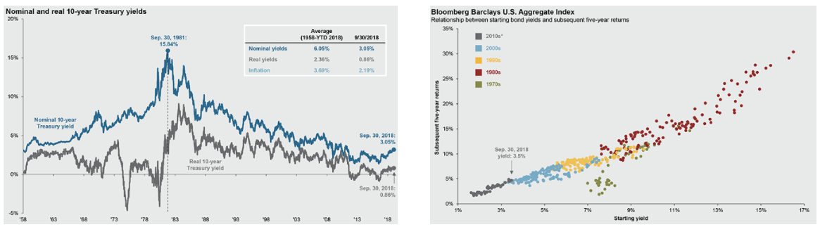
On the left we can see the steady climb in yields we’ve been talking about since 2016. On the right, we are able to observe total returns of the U.S. Aggregate Bond Index over the last 40 years5. The two images should look like mirrors of each other. But what we want investors to take away here is, higher yields have historically led to greater total returns in the fixed income asset universe. With inflation seemingly under control at the moment, we don’t think there are strong parallels to the ‘70s in today’s environment. So we take this rise in yields as a net benefit to bond investors.
Enough About Bonds: What Just Happened to Stocks?
Earlier this year investors were reintroduced to volatility. After a year for the history books, the S&P 500 corrected in February (declined by 10%) after sprinting out of the gate like Secretariat at the Belmont Stakes in 1973. The tremendous machine took a breather and investors were forced to reassess market expectations. If not maybe from a return expectation stand point, at the very least a behavioral one. Less than two weeks into the fourth quarter and the market has pulled back by 5% from the all-time-highs reached at the end of September, and investors are searching for reasons as to why this is the one. First they came for bond yields, but we just dismissed that. Then they came for normal equity behavior, so now we’re speaking out.
Pullbacks are common. Corrections are common. Volatility is common. Not all downward movements in stocks are signs of paralyzing bear markets. In fact, most aren’t. Below is a convenient table from Yardeni Research of market corrections and bear markets in the Post War era. On this list there are 12 (by our count, 10 by definition) bear markets. Eight of them were accompanied by economic recessions. The two bear markets on this list that didn’t come along with a fundamental economic breakdown were joined by a crescendo slope in interest rates, and the other by a flash crash.
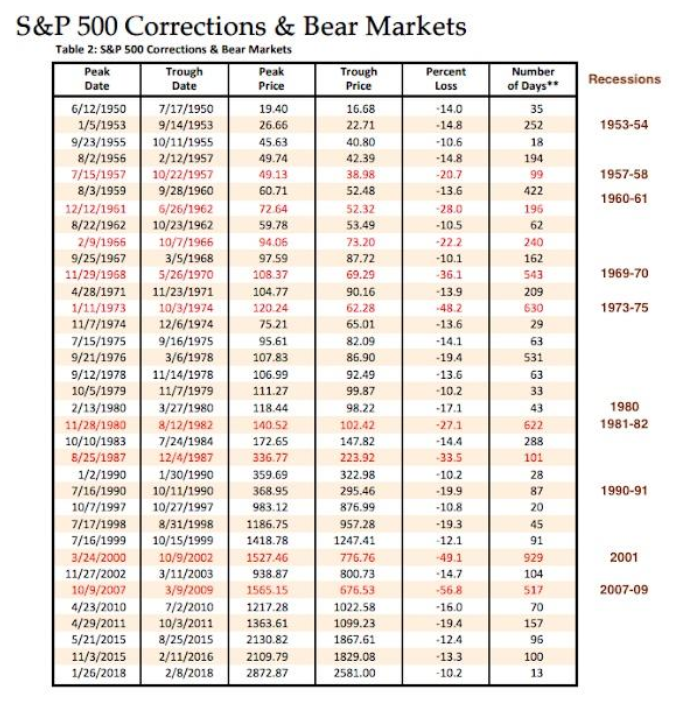
The concept of bear markets and recessions arriving together shouldn’t be too hard to digest. Economic recessions are by definition, periods of significantly weak consumer and corporate health and spending. Why wouldn’t this be the recipe for stock market weakness? Better question, do we see weakness in the economic data today? We don’t, yet. What should investors keep an eye on? Unemployment claims rising (currently at 18 year lows), S&P 500 peaking (on average, seven months ahead of recessions) and new home sales (see above about rising rates) are three indicators that have historically played a role in the recipe. Perhaps more applicable today, trade. But more on that later.
One last look at volatility in historical context to help investors be properly reminded what standard deviation has historically meant. Check out the chart we made below. These bars reflect the number of days the S&P has moved outside the band of returns of +1% and -1% in each calendar year from 1928 through October 10 of this year.
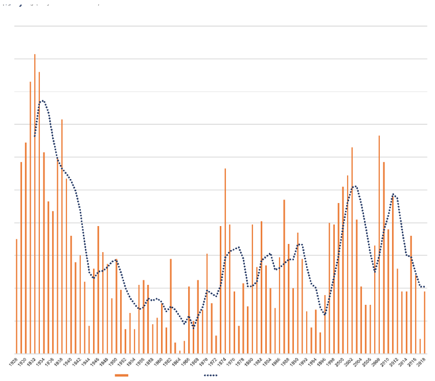
Structural developments within the market are largely at play here, which is why you can see higher spikes towards the left of the graph. But what we think needs to be taken away, are two things: a) Just how quiet 2017 was (nine days of 100 basis point moves in absolute value terms) b) how normal 2018 has shaped out to be until this point. Stocks rise, stocks fall, and stocks rise again. More times than not.
WHAT’S AHEAD?
The fourth quarter has started off with a bang, and we think it’s only getting started. We won’t have any shortage of catalysts for noise to end the year. The midterm elections next month are at the top of the list. So, a quick note on political parties and portfolios: don’t mix them. Separation of partisan and portfolio is high on our list of investment advice to all market participants. We aim to keep our investment decisions evidence based, and long-term in thinking. But if Capitol Hill asset allocation is your thing, keep the below in mind6:
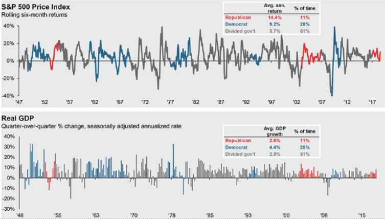
We spend the majority of the time with a gridlocked governing body. Even with the struggle this breeds from a policy stand point from time to time, equity returns have still historically been positive, albeit slightly below the long-term average annualized return. Single party representation has yielded slightly better results with a smaller sample size. Republican leadership has shown to be fruitful for equities, while Democratic powers have generated greater economic growth. So, let’s call it a wash and move on. We don’t view midterm elections as macro events with significant implications the way the general election can be perceived. So, we recommend investors don’t confuse the noise and/or results surrounding the event for signal, potentially impacting their investment decisions.
What’s happening in November that’s garnered a bit more of our attention? The two leaders of the (not?) Trade War that’s unraveled this year. President Trump and President Xi have agreed to meet at the end of November in Brazil at the G20 Summit. With tariffs increasing both in dollar amount and imposition through the first three quarters, neither side has blinked (sort of). What’s at risk now is corporate earnings in 2019 here in the United States. Something we think all parties involved are likely to be protective over. It’s estimated that the threat of a 25% tariff on all Chinese imports would reduce the expected 2019 earnings growth rate from 10% down to 5%7 (aka by 50%). We first voiced our views that the, then developing, Trade War carried actual, and potential detrimental, economic implications. For example, the Federal Bank of St. Louis will tell us that when a country increases their tariffs by at least 3.5% in one year, imports as a percent of GDP decline by 2.5%, wages fall by close to 2% and investment-to-GDP declines by 1%8. Naturally, corporate earnings would follow suit.
We can’t do anything but assess the evidence and data as we receive it. That’s all we as investors have ever been able to do. Regardless of the narrative searching that comes with hindsight analysis.
For our full quarterly report, click here.

SOURCE: This presentation is solely for informational purposes and should not be taken as investment advice. For further information, please contact one of our investment adviser representatives.
1Data from Bloomberg
2Data from Federal Reserve Economic Data
3Data from Bloomberg
4Vanguard
5J.P. Morgan
6J.P. Morgan
7J.P. Morgan
8Federal Reserve Bank of St. Louis study conducted for the period 1980-2006
LEGAL STUFF
THIS PRESENTATION (THE “PRESENTATION”) HAS BEEN PREPARED SOLELY FOR INFORMATION PURPOSES AND IS NOT INTENDED TO BE AN OFFER OR SOLICITATION AND IS BEING FURNISHED SOLELY FOR USE BY CLIENTS AND PROSPECTIVE CLIENTS IN CONSIDERING GFG CAPITAL, LLC (“GFG CAPITAL” OR THE “COMPANY”) AS THEIR INVESTMENT ADVISOR. THE OPINIONS CONTAINED HEREIN ARE NOT RECOMMENDATIONS.
THE INFORMATION CONTAINED HEREIN HAS BEEN PREPARED TO ASSIST INTERESTED PARTIES IN MAKING THEIR OWN EVALUATION OF GFG CAPITAL AND DOES NOT PURPORT TO CONTAIN ALL OF THE INFORMATION THAT A PROSPECTIVE CLIENT MAY DESIRE. IN ALL CASES, INTERESTED PARTIES SHOULD CONDUCT THEIR OWN INVESTIGATION AND ANALYSIS OF GFG CAPITAL AND THE DATA SET FORTH IN THIS PRESENTATION. FOR A FULL DESCRIPTION OF GFG CAPITAL’S ADVISORY SERVICES AND FEES, PLEASE REFER TO OUR FORM ADV PART 2 DISCLOSURE BROCHURE AVAILABLE BY REQUEST OR AT THE FOLLOWING WEBSITE: HTTP://WWW.ADVISERINFO.SEC.GOV/.
ALL COMMUNICATIONS, INQUIRIES AND REQUESTS FOR INFORMATION RELATING TO THIS PRESENTATION SHOULD BE ADDRESSED TO GFG CAPITAL AT 305-810-6500.