

Another winter solstice has come and gone, and we are looking at a landscape that few envisioned just 12 months ago. We warned against annual predictions here last year, and we stand by that belief still. However, we’ll point out that our one prediction did come true: we made it around the sun once again. It seems like just weeks ago, the praises of global synchronized growth were being sung from the hilltops and robust GDP expectations were being thrown around like a new car at an Oprah holiday special. Consensus expectations largely called for a third consecutive year of double-digit equity returns for the S&P 500 (let that sink in for a second). So…what happened?
Well: bond yields rose on the front end of the curve flattening out most of the premium holders of long-term U.S. debt were being paid, the S&P 500 saw its highest level of single day +/- 2% moves in seven years, more than $350B in tariffs were imposed between the U.S. and China and fractures in policy benefits domestically began to align with weakening growth outside of the U.S. The secular bull was met with a vicious cyclical bear that many investors perhaps thought had gone extinct. Turns out it was just in hibernation. Pairing back excessive risks and opportunistic exposures for the last 24 months has been part of our playbook in anticipation of an environment like this. Investors now will be put to the psychological and emotional test in 2019.
Understanding normalcy in terms of volatility and cycles is key to staying the course and not overreacting to changes in the environment. But be advised, winter is here.
HOW’D WE GET HERE?
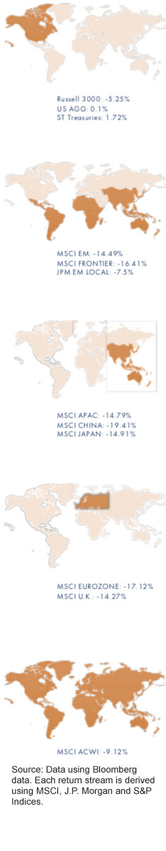 U.S. equities took a step backward in 2018 as the Russell 3000 index (~98% of the U.S. equity market) slid by 5.25%. Narrowing the universe a bit, the S&P 500 finished the year down by 4.39% on a total return basis. A pedestrian negative return calendar year for the equity market, the previous 12 months were bookended with two separate market corrections, the second of which saw the S&P 500 declined by 20% from its high in September through the end of the year. The year-end numbers don’t paint the whole picture for investors who were forced to navigate a very choppy environment in both stocks and bonds. The U.S. Aggregate Bond Index managed to turn out a positive return of 0.1% for the year.
The weakness outside of the U.S. was a bit more extreme in terms of net total return for the calendar year. But the pain inflicted came in a more steady, consistent drumming for risk assets outside the U.S. boarders. Emerging market equities posted a negative total return of 14.49%. For those keeping score at home. However, the EM performance relative to their developed counterparts saw a short-term bottoming in October, partially offsetting the Q4 U.S. bear market.
Coming off an exceptionally strong 2017 campaign (MSCI China 49% total return), Asian risk assets took it on the chin in 2018. The whipsaw of the MSCI China index has seen its annualized return for the last two years compressed to just 10%.
Another 2017 bright spot was European equity markets which posted close to 30% returns for Eurozone companies in the previous period. In 2018, these gains were largely halved as the weakness spread across the Atlantic early on in the year. Signs of economic weakness within the EU seemed to be magnified with the instability of U.S. policy among its trade partners.
The weakness in the global capital markets for the previous twelve months served as a sobering reminder for many just what equities were capable of. Negative calendar year returns haven’t been posted in the U.S. in a decade (2008: -38.49%), but that doesn’t mean they shouldn’t be expected. Since 1999, the average calendar year return for the S&P 500 has been just 4.37% with a standard deviation of 17.21%. With a distribution of returns of that nature, investors have seen negative price returns in 30% of the calendar years over the period. Moving forward, we don’t expect this trend to change much, and given the weak foundation of the market today, we see more evidence that says we’re headed toward more choppy sessions from here.
2019 INVESTMENT THEMES: WHAT TO WATCH FOR
- Let’s Get Real About Returns
“Low return environment” has been the headline for as long as investors can remember. Let’s take a look at what the trailing twenty years have looked like, and where valuations potentially point us from here. - The S&P 500’s Sunken Place
The S&P 500 spends nearly 33% of the trading days below the 200-day moving average. Falling below the 10-month moving average has proven to happen at a less frequent rate. But once there, the market has proven to struggle to remain on its best behavior. - Bear Attack Survival Guide
Something many investors who’ve been in the market for the last decade haven’t experienced, this market phenomenon is a reminder that there is indeed a second side to the coin. Here are some tips to making it through the bear market. - Fact(or)s of Life: As market environments begin to change, and cycles start to age, we take a closer look at how investment factors have performed during periods of weakness and fragility for the last 30 years. Something investors will need to be aware of as we move ahead into 2019.
- Time: Time is undoubtable a finite resource. But some of us have more of it on our side than others. That doesn’t mean we can afford to take for granted. It also doesn’t mean we need to become overly concerned with the 12 months right in front of our face. Managing our energy is a bigger challenge than managing out time.
LET’S GET REAL ABOUT RETURNS
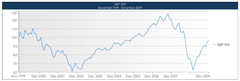
The warnings of a low return environment can be traced back roughly 20 years now. Let’s take a second to gun the DeLorean to 88 and revisit the context for which these market calls were being made. Equity valuations were sky high, a bubble in technology was popping, we were entering a decade that would prove to be bookended by two recessions (one of which was a crisis) and stocks were in the midst of the worst 10-year period in history.
How’d stocks fare? Negative annualized nominal returns of -0.91% for 10 years (2000-2009). Throw inflation into the mix (median level of 2.7% for the period) and you’re looking at nearly a negative 4% annualized real return for a decade1.
Source: Data derived from Bloomberg data. Charts made by GFG Capital
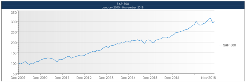
This ten-year period was followed with the longest economic recovery in U.S. history matched by a total return of the S&P 500 of 171% from 2010 through 2018’s campaign. An annualized nominal return of 11.71% for nearly a decade has investors questioning whether or not we’re in an environment where expectations should be tamed2.
Source: Data derived from Bloomberg data. Charts made by GFG Capital
So, who was right? Well that all depends on when you were in the market. Markets aren’t a static mechanism of measurement, because the data they are measuring is continuously changing. The depiction of what environment we’re in can easily be manipulated by data given the side of who’s making the argument. But combining this 19-year period, and stocks have returned just 4.86% in nominal terms annualized. Inflation has hovered around 2.2% over this time, meaning U.S. equity investors (as measured by the S&P 500) have roughly broken even for almost 20 years3. So now what?
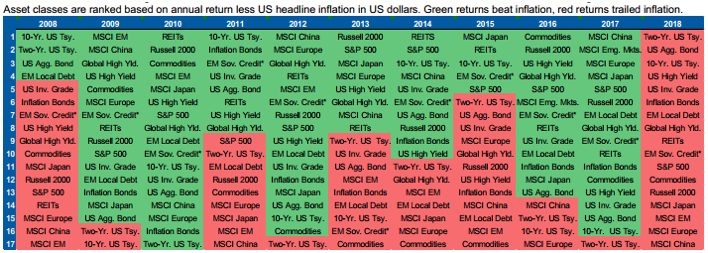
The environment we’re navigating as we enter 2019 consists of a secular bull met with a cyclical bear, an aging economic cycle, interest rates on the rise, sentiment on the fritz, a trade war unfolding and valuations relatively elevated. Much of the same narrative was in place for 2018 and what type of return did that yield for diversified portfolios? Negative. Among the 17 major asset classes tracked by investors, none of them provided a positive real return for the calendar year4. While inflation didn’t exactly run rampant (one of our 2018 risks) like in the ’70’s, it casually reminded investors of the silent benchmark you must first clear in order to preserve your wealth.
Source: Morgan Stanley
How do we look in regard to expected returns? Valuations often times are the biggest tell in what an investor could potentially make on their invested capital. Quite simply, the valuation is the hurdle your return must first clear before you’re in the black on any investment. When adjusting corporate earnings for cyclicality (referred to as the CAPE ratio, as created by Robert Shiller) we’re able to assess what forward-looking environments have historically been when valuations reach certain thresholds. Below are the forward 36 month returns in relation to the CAPE reading on the S&P 500 for more than 135 years. Traditionally, when the CAPE ratio is above 30 (2 Standard Deviations above the long-term average of 16.92), returns have been negative on a three year annualized basis 35% of the time5. In 2017 we saw the CAPE on the S&P breach 30 for a stretch of 15 consecutive months. It wasn’t until the December selloff did the ratio fall back below 30, where forward 36-month annualized returns have been positive just 55% of the time (when the CAPE registers between 25-30)6.
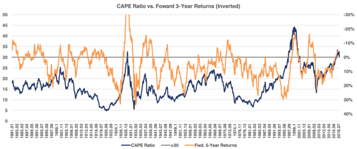
Source: Data derived from Bloomberg; Chart made by GFG Capital
But given the relatively small sample size of the CAPE ratio registering readings in the 2 standard deviation range (4% of months), we can turn to more traditional valuation metrics as well. Take the below into consideration:
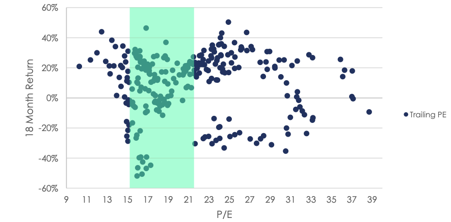
Forward MSCI World Returns vs Trailing P / E Ratio
2018 witnessed a collapse of the trailing P/E ratio on the MSCI World Index of 26% (from 21x on Jan. 1, 2018, to 15.5x today, Jan. 1, 2019). What this has done is move the valuation on the index from the upper band of historical valuation to the bottom of this band (1 SD from average). Historically, forward 18-month price returns for the index have come in at 7.5% (or 4.9% annualized) when this has been the case7.
THE S&P 500’S SUNKEN PLACE
Price is the vehicle for which we as investors get to voice our opinion on the market and the environment we’re in. The ultimate measure of supply and demand, there’s a lot that can be said about price action. This means there are many ways to muddy the waters and complicate the picture. Which is why sometimes it’s easiest to smooth out price action with a moving average. For investors who are keeping a long-term mindset, defaulting to the 200-day moving average is common. Generally speaking, markets tend to be in healthier trends and behave in a more controlled manor when price is above this indicator. Simple logic would defend this theory as: if price is higher than the average for the last year (+/-) then expectations say we’re headed toward a better place, economically speaking.
An alternative to the 200-day moving average is the 10-month moving average. The net difference is 10 trading days (210 in the 10 MA), but there’s one characteristic we like about the 10-month that secures investor’s ear muffs a bit tighter: no daily data points. Restricting the view to month-end pricing allows for the focus to solely be on long-term trends. Reducing the potential for head fakes driven by intermonth volatility. Below you can see the 32 occurrences that the S&P 500 has dipped below its respective 10-month moving average (red line) on a monthly closing price basis since 19028:
Source: Chart derived from TradingView.com
When observed over the course of a century, the whole picture seems to not show many signs of distress. But trust us, it’s there. Homing in on the last five instances, the picture becomes a bit clearer as to just how volatile, and negative, markets tend to be when trading below the 10=month moving average.
Welcome to The Sunken Place.
Below is the S&P 500 monthly closing price dating back to 2000 with its 10-month moving average (10MA: red) drawn as a barometer:

Source: Chart derived from TradingView.com.
Notably, you can see the historical events of the Tech Bubble and the Financial Crisis. Each of these crosses coincided with an economic recession shortly after the breach of the moving average. The market was pricing in a vastly different environment than the trailing 210 days.
The other three instances in the time frame came when there was ample concern of recessionary conditions materializing: 2011 European Debt Crisis, 2015 China Slow Down and 2018 Trade War and flattening yield curve.
This is just a snap shot of what the other 27 instances have been like over the course of the last 116 years. The complete table is below. The gray bars represent a cross that preceded an economic recession in the U.S.9:
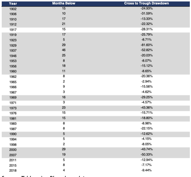
Source: Table using Bloomberg data.
In the 32 instances since 1902 where the S&P 500 fell below its 10MA, 18 of them have accompanied or preceded a recession. On average, trips to the sunken place have lasted 13 months with a standard deviation of +/- 10 months.
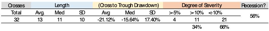
Life below the 10-month has proven to be a very difficult environment to match the historical average returns equity investors have grown somewhat accustomed to (remember the low return environment?).
With realized volatility greater for equities when under the 10MA vs periods when the index is above the indicator, investors have realized negative returns on a more consistent basis. The index experiences some of its steepest drawdowns/bear markets when it is below its 10MA. Also, the bulk of the pain isn’t felt until the breach has occurred, not the slide on the way down to the average when above it.
Dating back to 1990 the return profile of the two scenarios are illustrated below10:
Source: Bloomberg data, graph made by GFG Capital.
This isn’t about market timing. This is about understanding your surroundings as an investor, and where you are within the market’s cycle. Being cognizant of these cues and characteristics can help you tame expectations, as well as your reactions to market gyrations. Over the last 28 years, the difference in price return of time fully in the market and only the months spent above the 10MA have been separated by 13 basis points on an annualized basis. But the outperformance of being above the 10MA during this time has come at the cost of 26% less volatility, and a max drawdown that doesn’t register as a bear market. As we begin to float below the moving average for the first time in nearly a decade, we encourage investors to be mindful of the deception that can come in market price behavior until clear signs of health are once again displayed.
BEAR ATTACK SURVIVAL GUIDE
“I saw Wedding Crashers accidentally. I bought a ticket for “Grizzly Man” and went into the wrong theater. After an hour, I figured I was in the wrong theater, but I kept waiting. Cause that’s the thing about bear attacks… they come when you least expect it.”- Dwight Schrute, Dunder Mifflin Paper Company
Nobody ever concerns themselves about bear attacks until they’re greeted by a 7ft 450lb grizzly bear on a hike in the Adirondacks. Or until they realize they’ve been the target of a hunt when on an excursion to see Denali. The way we see it, you have two options: continue on your expedition in hopes of reaching the mountain top without ever coming across the beasts that inhabit the terrain you’ve ventured into or have a plan of action. Bear markets, like bear attacks, are few and far between. But if you’re going to spend ample time in the natural habitat, here are a few tips of how to spot and survive a bear market:
- Not every briar patch is a bear’s den: Your senses might be heightened and your natural response to flee the growling bushel might be growing louder. But keep in mind since 1950, only 30% of market corrections of 10% have turned into Bear Markets11. Don’t panic.
- Know your surroundings: Most bear markets occur when the market is trending below its long-term indicators (10MA). If you’re experiencing a market that is showing long-term trends with a negative slope, know that the bear might be on its way.
- Don’t get aggressive: Survivalists will tell you that the best plan of action to survive a bear attack is to be very still and curl into the fetal position (i.e. play dead). Surviving a bear market isn’t much different. In fact, for a long-term investor, sticking to your investment plan and dollar cost averaging down might be the best thing to happen to your portfolio. But don’t confuse this with the itch to become overly aggressive and fight back against the bear. Rallies in bear markets are often times extreme and misleading. So long as the overall trend is lower, the advantage will continue to lie with the bears over the bulls.
- Be patient: Bears are curious creatures. When it comes to people, they’re generally not predatory. Moves within bear markets are fast, just like the creatures they’re named after. You’re not going to outrun something that can cover 60 kilometers an hour uphill. You’re also likely going to struggle overpowering it in a fight. Your best chance of surviving might be: wait it out. Since 1950, the average bear market has lasted 341 trading days (1.5 years) and has seen a drawdown of 34% from the previous peak. Coming into 2019, we were 72 trading days in, and have seen a drawdown of 20.2% in the current environment12. Patience is likely the best plan of action here.
FACT(OR)S OF LIFE
We’re all consciously or subconsciously factor investors. Since the dawn of markets, investment approaches have been crafted and tested to fit specific investors’ preference. For more than a century, these factors have be known as investment criteria for selecting investments at the start of building a portfolio. Graham & Dodd, Buffet & Munger, Fama & French, Dow and Livermore. All of these investors sought out to identify investments that carried specific characteristics that satisfied them before implementation. These criteria are known as factors.
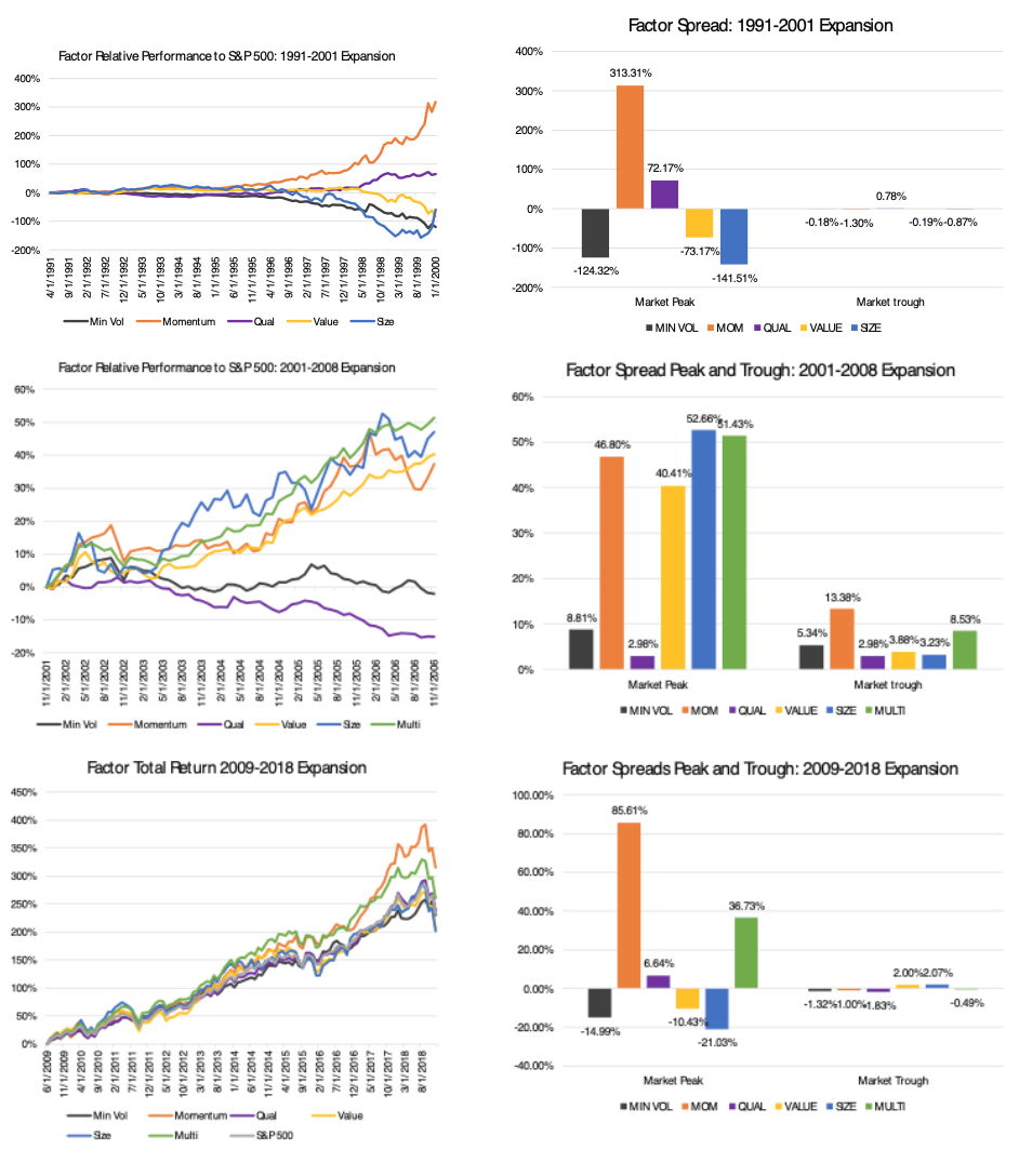
Seeking out, isolating, mixing and integrating investment factors within a portfolio have proven to help protect an investor’s principle during periods of market and economic weakness, as well as provide additive returns in times of market rallies and expansion. In order to illustrate just how these factors demonstrate persistent outperformance of the traditional market cap weighted index throughout different periods of the market cycle, we’ve gone through the last four economic recessions, eight trips to the Sunken Place and two bear markets. Collectively through the 346 monthly periods (7182 trading days), we look at the performance of momentum, quality, value, size and minimum volatility factors.
Recessions and Expansions
Intuitively speaking, different factors (whether they’re security-driven or fundamental in nature) will carry different behavior traits across various points in the market and economic cycle. These factors are like the characteristics of our own personalities as humans. Your makeup and natural tendencies will dictate how you respond to life’s moments of stress and exuberance differently from the next person. The two periods we identify from an economic cycle that investors tend to concern themselves with the most are recessions and expansions. Since 1990 the U.S. has experienced three recessionary periods followed with four expansionary periods. This accounts for 34 months of recession and 312 months of expansion.
For years, investors have been taught to identify companies that perform better across the various periods of the cycle based on their business model. We think identifying these companies through the lens of these five factors can prove to be a more effective tool of analysis.
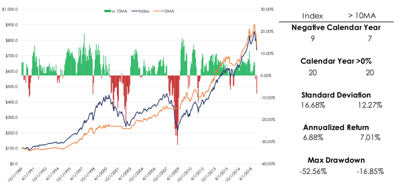
First a look at the recessionary periods13:
Source: Bloomberg data. Graphs made by GFG Capital
Periods of stress within the economic machine have proven to show the greatest dispersion amongst the isolated factors within our analysis. If an investor were to think of these factors in terms of a spectrum of volatility, then they could intuitively connect that more volatile factors (size, value, momentum) have seen a harder time in providing a positive relative performance to the broader market. While factors centered around reigning in the dispersion of price (minimum volatility) have been able to provide significant outperformance at the market’s troughs during these economic environments.
The factor spread when observed in economic expansions looks starkly different, particularly at market troughs14:
Source: Bloomberg data. Graphs made by GFG Capital
These extended periods of economic expansion have been accompanied by prolonged equity market rallies. In these expansionary rallies, the inverse can be seen when compared to recessionary times. More aggressive factor exposures (momentum, size) have led the way higher. What is most interesting is the difference the backdrop in economic conditions have made in periods of market troughs. Factor dispersion in times of economic expansion, coupled with market troughs, have shown little dispersion in alpha. Bringing an enhanced importance on factor exposures for investors during periods of economic stress.
We can observe these same factors in each of the S&P 500’s trips to the Sunken Place since 1990 as well. Below we highlight each trip since 2000 (trips in the 90’s were <five months each)15:
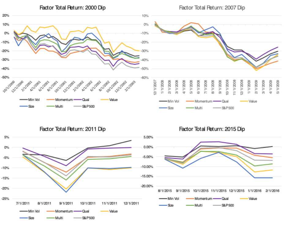
Source: Bloomberg data. Graphs made by GFG Capital
The S&P 500 has fallen below its 10-month moving average since 1990 eight times. Five of the trips have occurred with no economic recession, and the trip in 2000 (September 2000-March 2003) preceded and long outlasted the recession in 2001. In each of the periods, minimum volatility has proven to be the most consistent protector of capital, particularly when the cross occurs outside of a recession. Quality has also proven to protect capital outperforming the S&P 500 in each of the 8 trips with the exception of 1994.
The evidence we see surrounding factor returns during periods of economic weakness and market fragility support the need to be cognizant of factor exposures, in order to best prepare for changes in market environments. Aligning a portfolio with factor exposures that best suit a profile and objective is the most important step for investors over the long term.
As environments evolve over an investor’s time horizon, pairing factor tilts with core factor exposures will be a way to protect from market gyration and participate in rallies in ways their core may not be designed to.
TIME
“Many failures can be traced to the pointless pursuit of arbitrary benchmarks. Most notable is the calendar, which pushes investors to cut corners before the earth completes its rotation around the sun. Swap out the sun for another celestial body and you’re describing a mental illness. Another is indexes. Which use something short-term and broad to guide something long-term and specific.” – Unknown
No investor is comfortable with losing money. So, when our self-inflicted timing mechanism is telling us that time is running out, there is a natural tendency to become hyper-sensitive to our gains or losses. The bear market that overtook the S&P 500 in 2018 might have added insult to injury for many investors given the time of the year it took place. A calendar year that was on pace to see a 15.7% return ended the year lower by more than 6% in price terms.
But unless you’re a professional money manager with annual bogeys and incentives for calendar year performance, we don’t think investors should overly concern themselves with individual calendar year returns. Keeping in mind most investors spend more than 20+ years in the market in their lives, it’s key to remember that these single inputs are what make up the averages investors come to expect.
Looking at rolling returns, the S&P 500 has only three 20-year rolling period where returns were negative. Each of which took place before 1950. In other words: The S&P 500 has not experienced a negative rolling 20-year return period. Rolling 10 and five-year returns look promisingly similar. On a rolling 10-year basis, the S&P 500 has seen 12 windows of negative returns, 75% of which took place prior to 1980. Eighty-six percent of rolling 10-year windows since 1937 have been positive, annualizing at 7.36%. Seventy-five percent of five-year rolling returns have been positive since 1932, annualizing at a rate of 7.32%16.
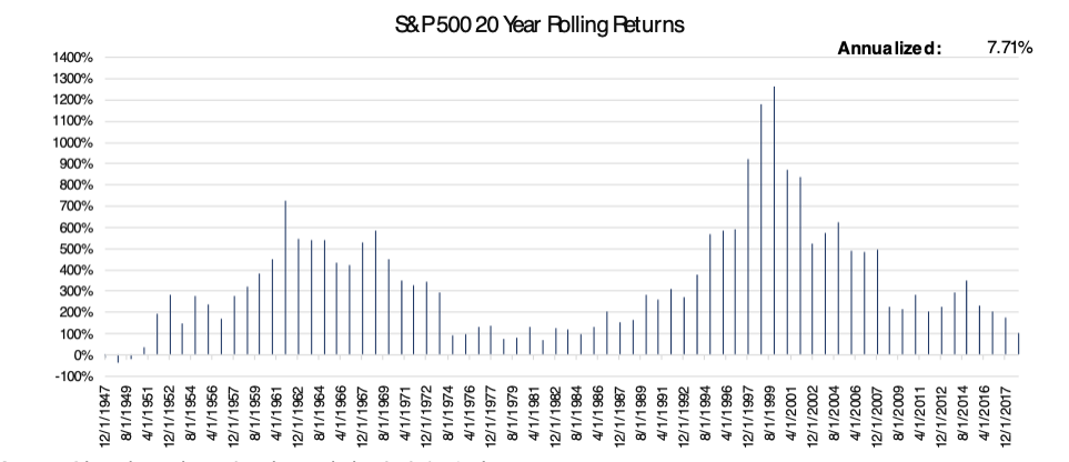
Source: Bloomberg data. Graphs made by GFG Capital
We don’t think investors should dismiss years of struggle and bank on the averages working themselves out over the long-term. That would be pure ignorance, and ignorance isn’t bliss. Ignorance is suicide.
Ignoring weakness within the environment you’re presently in will increase the chances of you being met with something you’re not ready to handle and will potentially jeopardize where you intended to reach in the first place.
Being able to count on a long-term investment horizon is a blessing and a curse for investors. It often serves as a pacifier for times of struggle within the market, or disappointment within a portfolio. Like a disgruntled sports fan, “there’s always next year” is a consolation they can tell themselves knowing they still have future opportunities.
But when that reminder begins to lose its effectiveness, investors can start to press. Force trades, convince themselves new opportunities should be sought out or abandon completely the process that’s been put in place. The privilege of a long-term time horizon requires investors to possess the stamina necessary to survive it. While it’s true, a lengthy time horizon carries what might seem like endless possibilities to expand your wealth, it also can be dark and full of terrors at times.
Listen twice, speak once. A mantra Tupac Shakur once echoed when discussing the importance of taking in what’s happening around you before acting. Investors can take heed of this advice when it comes to observing their portfolio. Managing your emotions twice as much as you manage your portfolio is a good way to help build the stamina necessary to survive your long-term time horizon in the markets.
Then again, who’s got time for that?
To download this commentary, click here.
SOURCES:
This presentation is solely for informational purposes and should not be taken as investment advice. For further information, please contact one of our investment adviser representatives.
1 Data using Bloomberg data.
2 Data derived from Bloomberg data.
3 Data derived from Bloomberg data.
4 Table from Morgan Stanley.
5 Data derived from Bloomberg, graph made by GFG Capital.
6 Data derived from Bloomberg.
7 Data using Bloomberg data.
8 Chart derived from TradingView.com.
9 Chart derived from TradingView.com. Table using Bloomberg data.
10 Bloomberg data, graph made by GFG Capital.
11 Bloomberg data.
12 Bloomberg data.
13 Bloomberg data. Graphs made by GFG Capital
14 Bloomberg data. Graphs made by GFG Capital.
15 Bloomberg data. Graphs made by GFG Capital.
16 Bloomberg data. Graphs made by GFG Capital.
LEGAL STUFF:
The opinions mentioned herein are those of GFG and should not be construed as investment advice. For further information, please contact GFG to speak to an investment adviser representative.
Information in this report is current as of December 31, 2018, it is not intended as a forecast or guarantee of future results, and is subject to change. This presentation (the “Presentation”) has been prepared solely for information purposes, it is not intended to be an offer or solicitation, and is being furnished solely for use by clients and/or prospective clients in considering GFG Capital, LLC (“GFG Capital” or the “Company”) as their investment advisor.
Past performance is no guarantee of comparable future results. The information provided should not be considered a recommendation to purchase or sell any particular security. You should not assume that any of the holdings were or will be profitable, or that the investment decisions we make in the future will be profitable or will equal the performance of the securities referenced. GFG includes information related to various indices. Financial indicators and indices are unmanaged, do not reflect any management fees, assume reinvestment of income, are for illustrative purposes only and have limitations when used for such purposes. None of the MSCI information is intended to constitute investment advice or a recommendation to make (or refrain from making) any kind of investment decision and may not be relied on as such. Historical data and analysis should not be taken as an indication or guarantee of any future performance analysis, forecast or prediction. All information derived from third parties is to the best of our knowledge accurate.
The information contained herein has been prepared to assist interested parties in making their own evaluation of GFG Capital and does not purport to contain all of the information that a prospective client may desire. In all cases, interested parties should conduct their own investigation and analysis of GFG Capital and the data set forth in this Presentation. For a full description of GFG Capital’s advisory services and fees, please refer to our Form ADV Part 2 disclosure brochure available at by request or at the following website: http://www.adviserinfo.sec.gov.
Certain information contained in the presentation discusses general market activity, industry or sector trends, or other broad-based economic market or political conditions and should not be construed as investment advice. Included in this article are links to other websites, including links to the websites of companies that provide pictures, related information, products and services. Such external Internet addresses contain information created, published, maintained, or otherwise posted by institutions or organizations independent of GFG Capital. These links are solely for the convenience of the reader, and the inclusion of such links does not necessarily imply an affiliation, sponsorship or endorsement.
Other sources, links, and information presented in this article are obtained from sources believed to be reliable, but they are for informational purposes only and GFG Capital does not guarantee their timeliness or accuracy.
All communications, inquiries and requests for information relating to this Presentation should be addressed to GFG Capital at 305-810-6500.